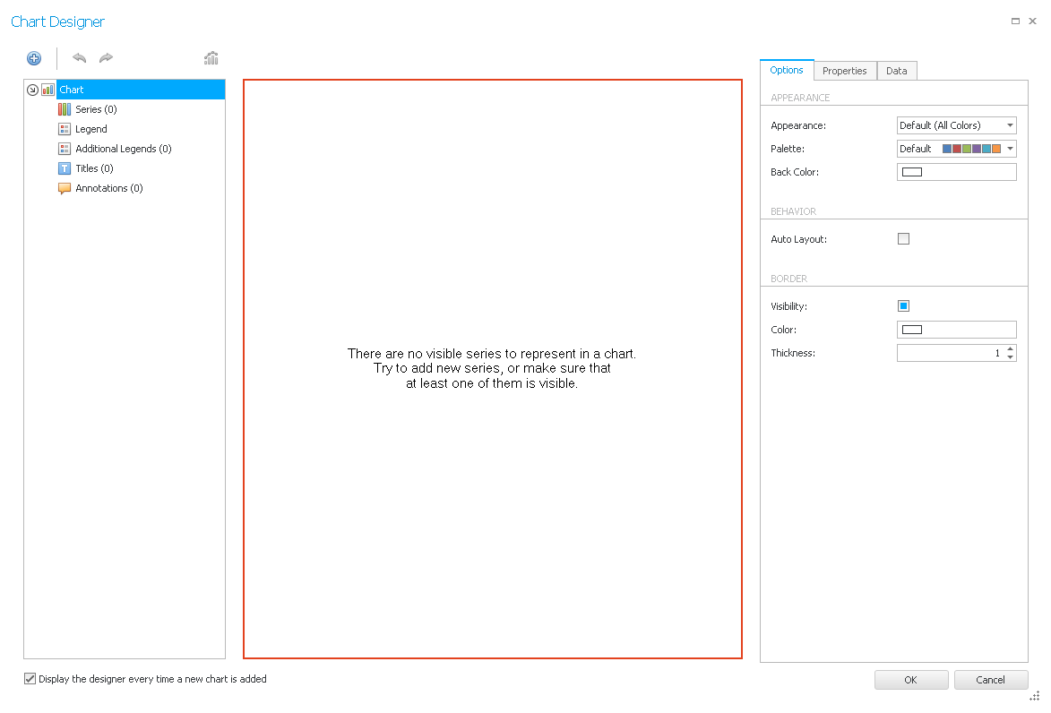
With the
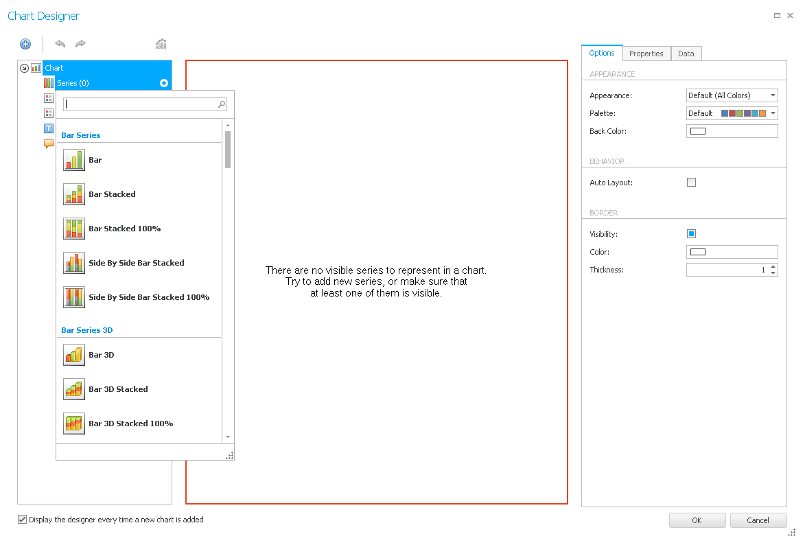
First you hold your mouse over Series in the left area and then click on the + symbol. You will now see the following list:
Here you choose a chart type. Now you should have the following view:
If you want to edit the chart type afterwards click on the
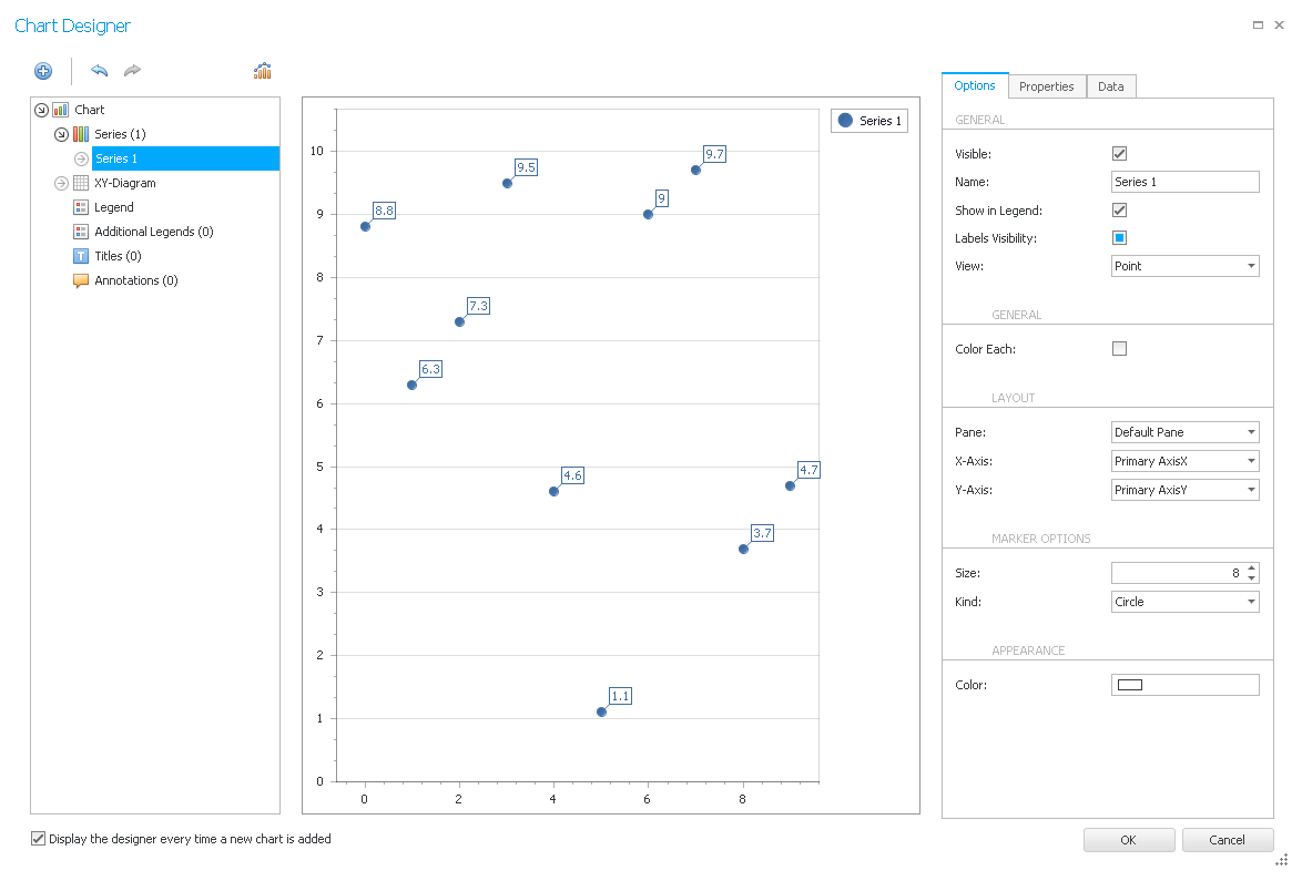
On the right side in the options you can enter a different name for the new series (values from a color that are content-related). You have the possibility to let this series be displayed in the legend by ticking Show in Legend. If you select Labels visibility the values of the single dots (or bars/lines) will appear in labels in the chart. If you tick Color each every dot (or bar/line) gets a different color. Depending on the chart type there will be further settings.
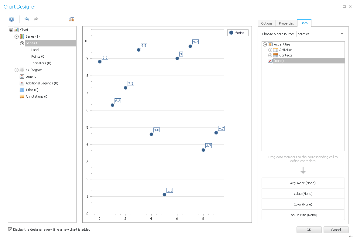
You can either insert the data for the chart from Act! or you add it manually. For the Act! option you go to the tab Data on the right side.
Now you drag the desired fields to the Argument area for the x axis and to the Value area for the y axis.
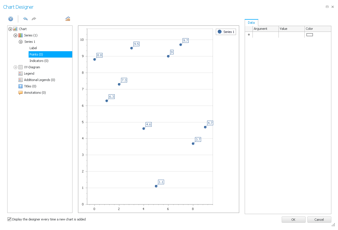
For the second option you go on Points on the left side. You will then see the following:
Now you enter your arguments and values on the right side. You can choose a different color for every dot.
Then you proceed to the Label settings. In order to activate the labels tick Visibility.
You can change the position of the labels and also display a line that connects the dot (or the bar/the line) with the label (and, if necessary, adjust the line length).
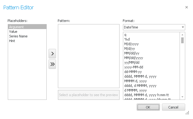
If you click on the three dots behind Text pattern the following window appears:
Here you edit what should stand in the labels. You either double click on the particular place holder or click on it and then on the
You can then pick the text orientation as well as the text alignment and the text color. You also have the possibility to choose a background color and a fill mode.
In order to display the border of the labels tick Visibility. You can then enter the color and the thickness.
In the tab Properties you find further settings.
The value range of the x and y axis will be adjusted automatically.
The legend displays the different series or the single dots and their names. You can remove these under Legend. You are also able to add an annotation.
Once you set everything you can go on OK.
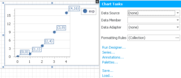
Your diagramm will appear now. You can edit it again with a click on the blue button with the arrow:
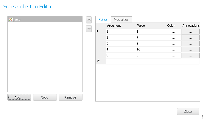
Here you have the possibility to create a connection with Act!. Choose dataSet1 for data source and the desired Act! field for data member. You can also create a formatting rule. If you click on Run Designer the same assistant as before will appear. In order to edit the individual dots (or bars/lines) go on Series. The following window will appear:
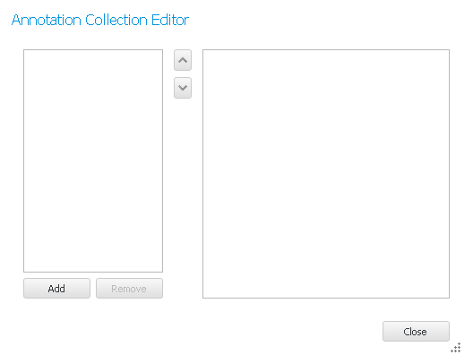
In case you want to add new annotations click on Annotations. This dialog appears:
Click on Add to create a new annotation. The following window appears.
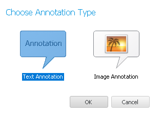
Now you choose if you want to add a text or an image annotation. Then you click on OK. You will have the possibility to edit the Appearance and the Behaviour. Once you set everything you go on Close.
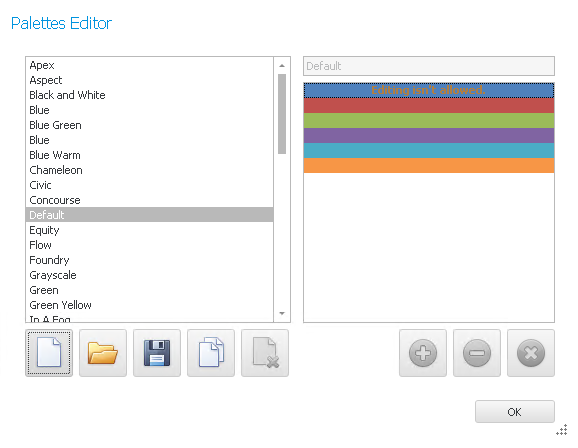
The next option is Palettes. If you click on it the following window opens:
Choose a color palette on the left. You can also create your own by clicking on the
The last two features are Save and Load (the settings).
Further settings can be found in the chapter Property Grid. |